
As part of a larger Community Health Improvement Plan, our clients asked for quick data summaries to provide a simpler look into what the needs of Monroe and Lenawee Counties are. To communicate these clearly, I chose to create a simple system where each area of public health is coded in a specific color, making it much easier to discern which area is being referenced while still being able to digest such large groupings of data.
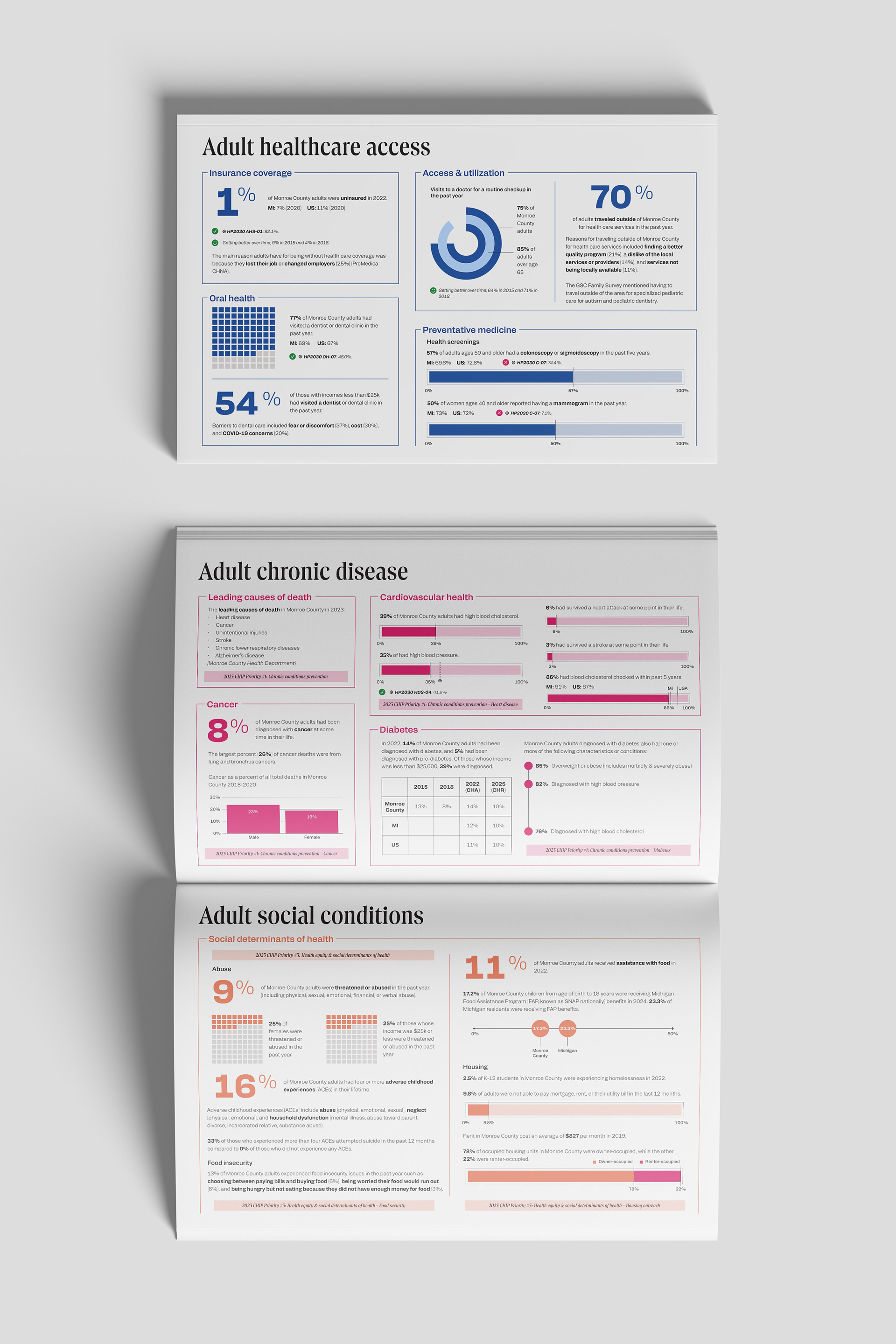
To break up monotony in visualizations, I researched new, innovative ways to show the point of the data set. Progress bars, waffle charts, timelines, and lollipop charts are a few examples used here. Even in ensuring the legibility of these new graphs, we were sure to include a section clearly stating how to read each one.