This rebrand project was done as a personal exercise to teach myself better ways to go about a rebranding for an existing company. Pete's Garage is an auto-themed restaurant in my hometown of Monroe, Michigan, and a large attraction of the place is their booths that are created inside of vintage cars from the 1950s to the 1970s.
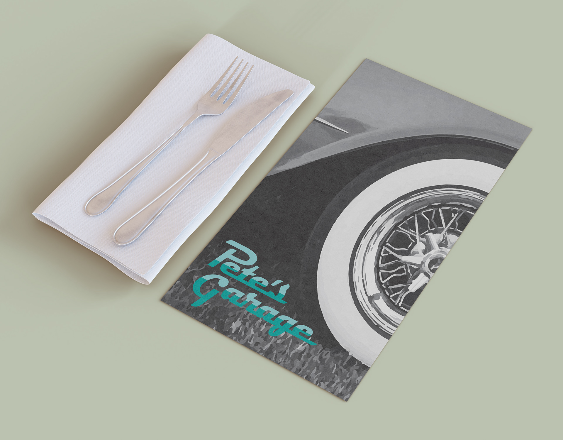
To begin, I started creating a moodboard of different aspects of vintage cars that could act as motifs that could run throughout the new branding to immediately give a passerby the idea that this restaurant is based around these vintage cars. One of these was chrome runners that span the length of the car. I though this was the perfect way to create the logotype because it easily depicts the time period and the industrial theme without excessive elements needed. The colors are also reminiscent of the classic teal color that many vintage cars came in.
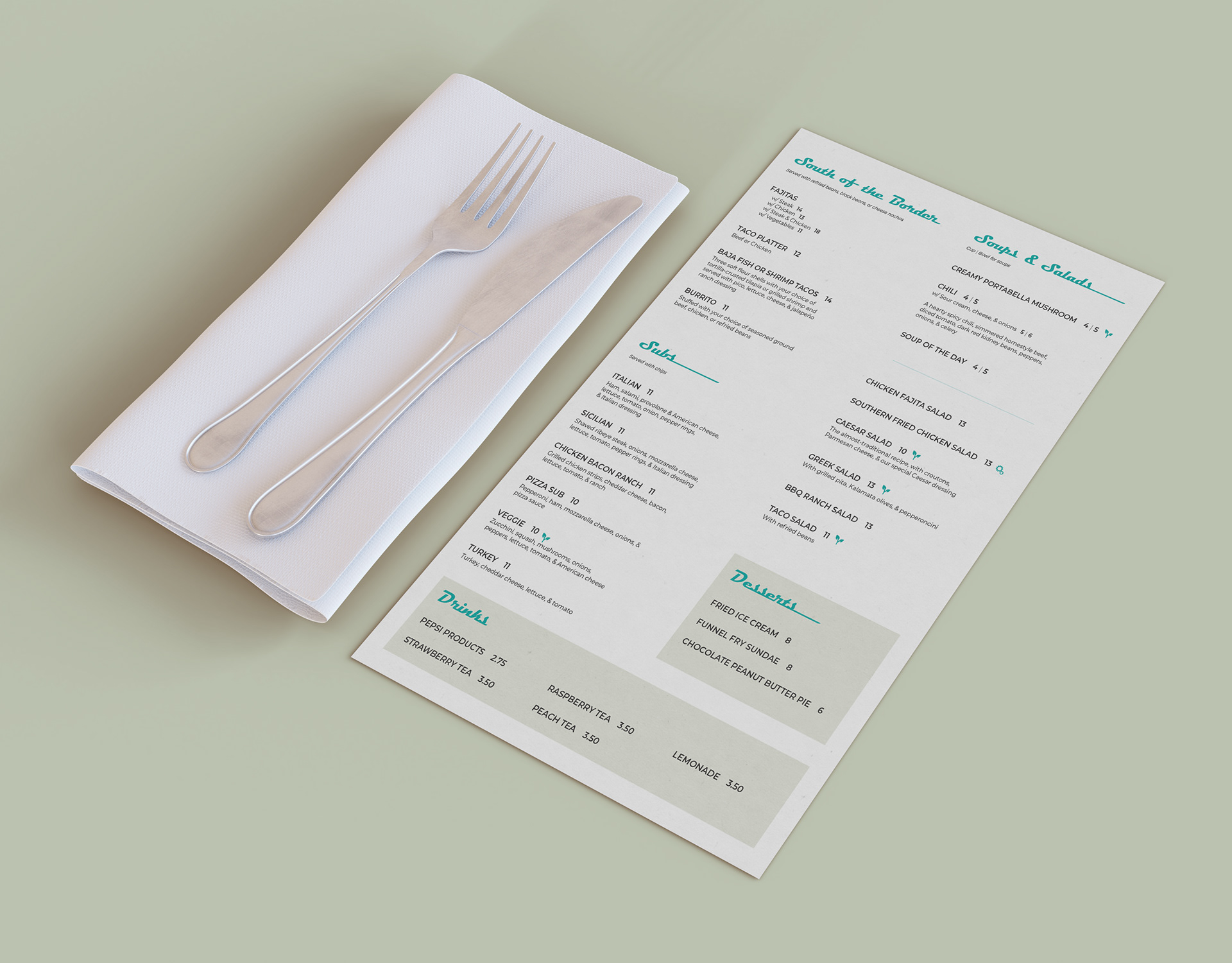
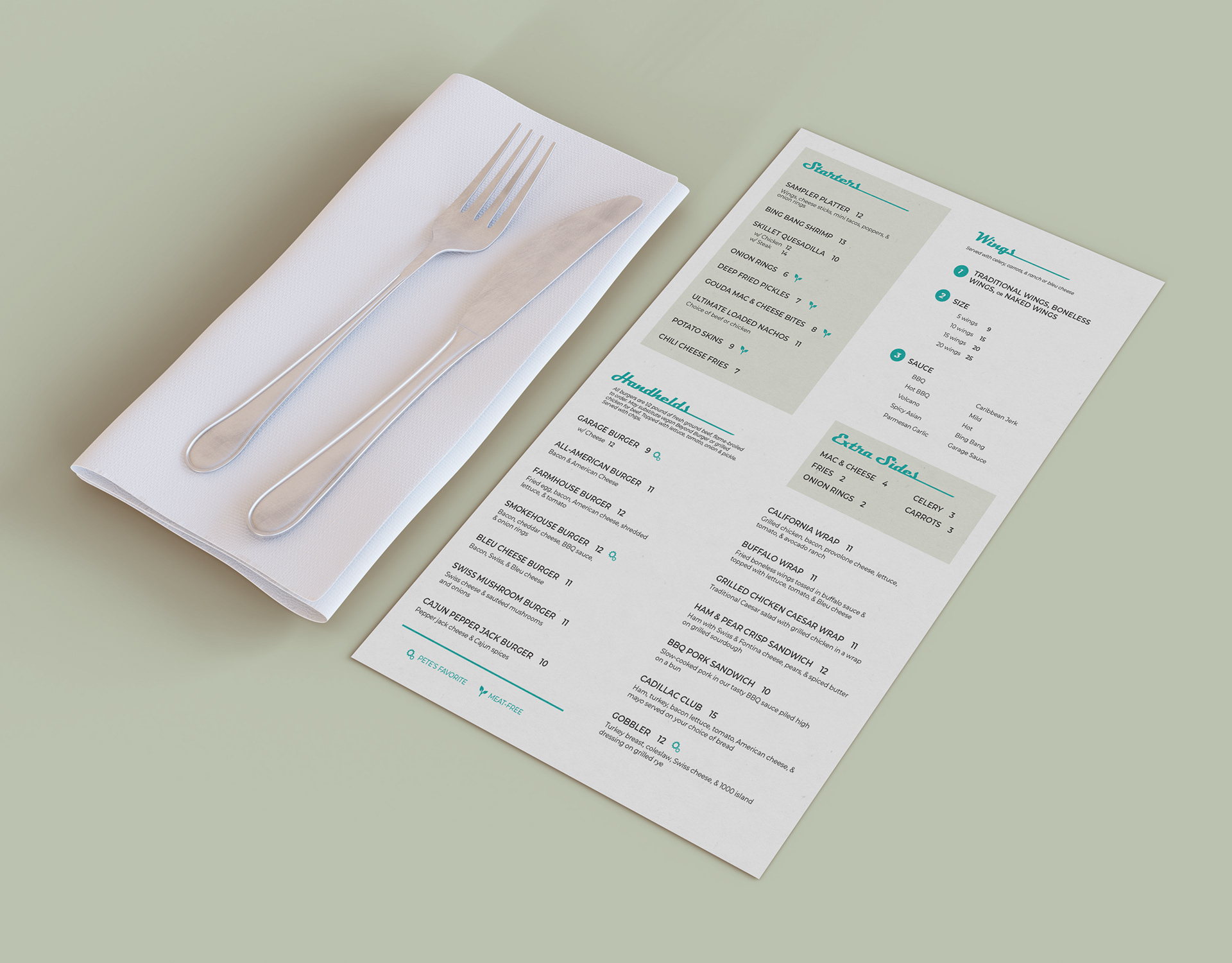
I brought this same typeface into the menu design as well. Because Pete's Garage offers a wide range of food choices, I opted to create the menu in a tabloid sizing and orientation to encompass all menu options in a compact fashion. Certain sections of food options that could bring in extra money are highlighted in the beige color to bring the customer's eye in.

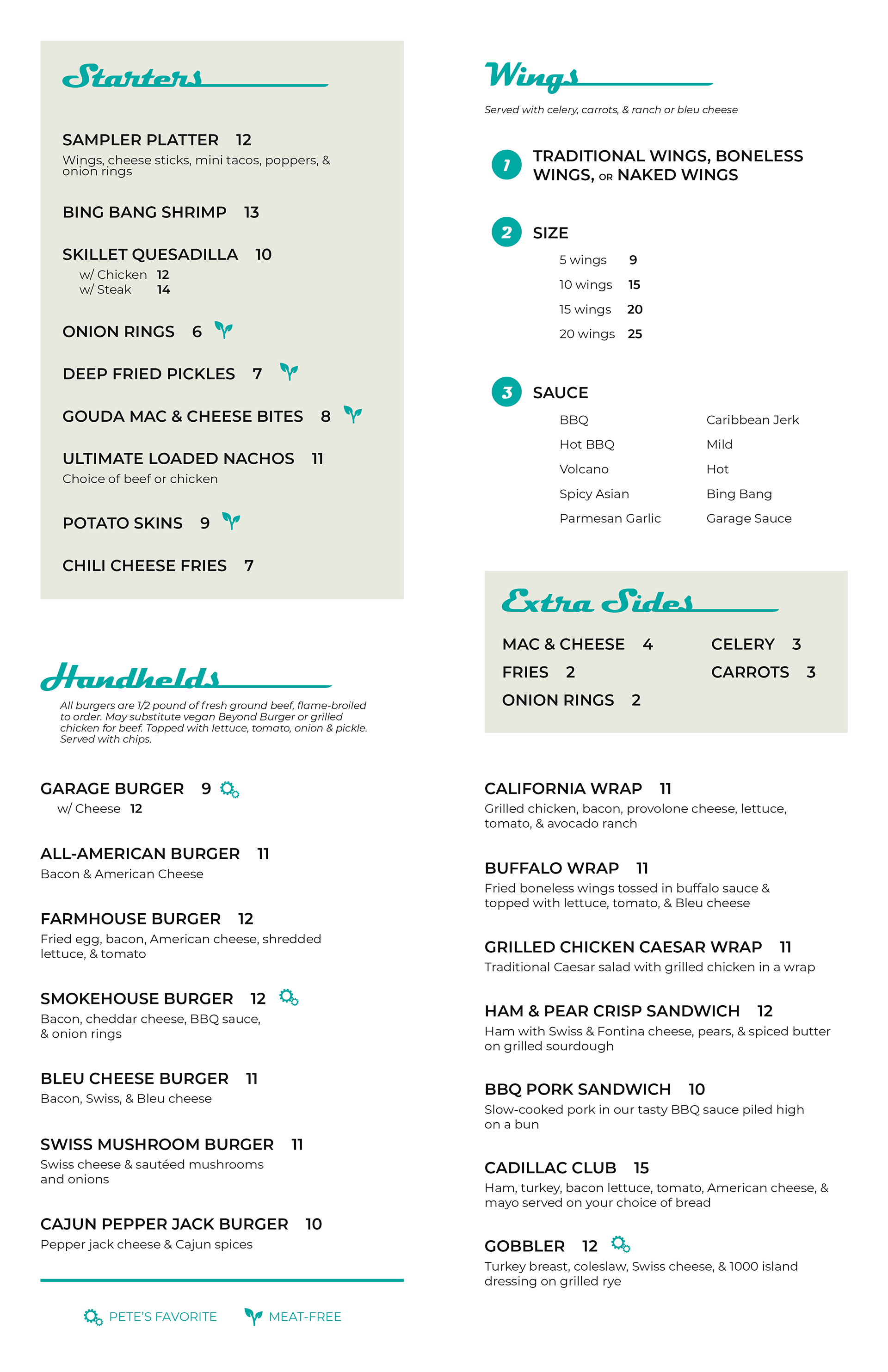
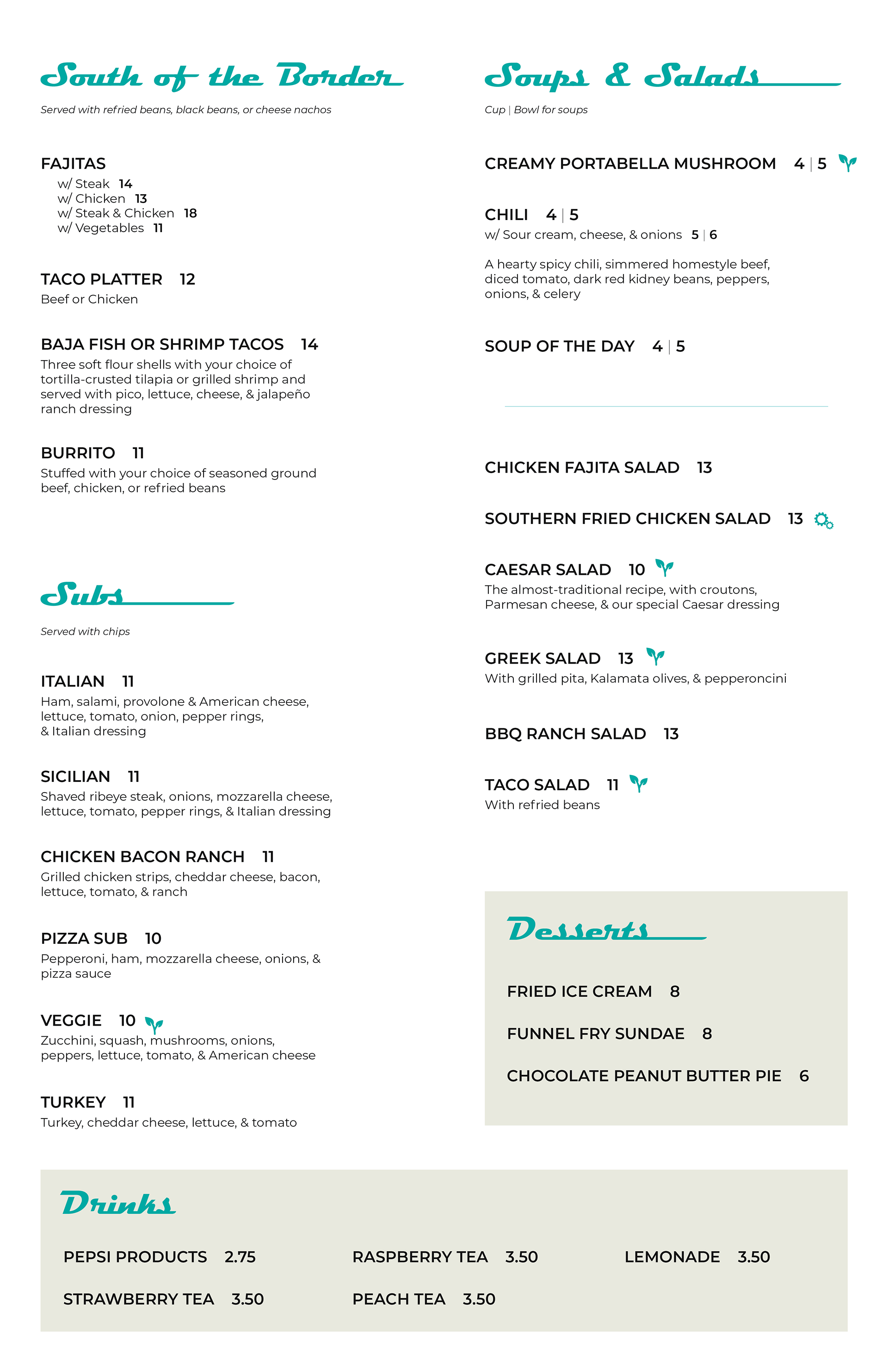

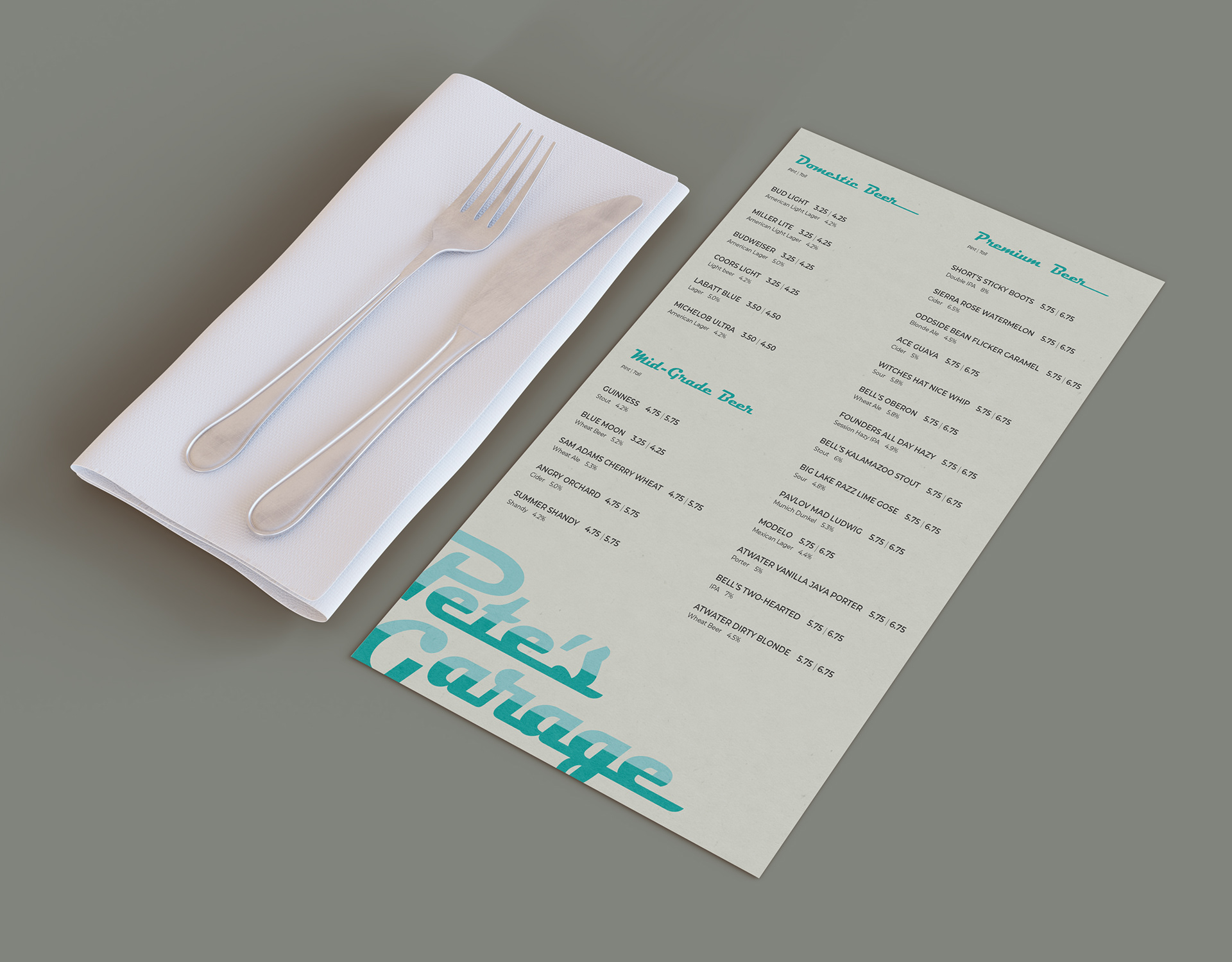
Higher priced menu items are marked with a custom gear icon to indicate "Pete's Favorite" to encourage more revenue. Meat-free options are marked with a custom plant icon to open up options for vegetarian or vegan customers. A separate draft beer menu is created with a full beige bleed to indicate a difference between the general food menu and the beverage menu.
A customized icon system gives the brand more of an identity and makes it easily distinguishable from other restaurants in the area. These can be used both in print and web-based formats and can be used to indicate anything desired.
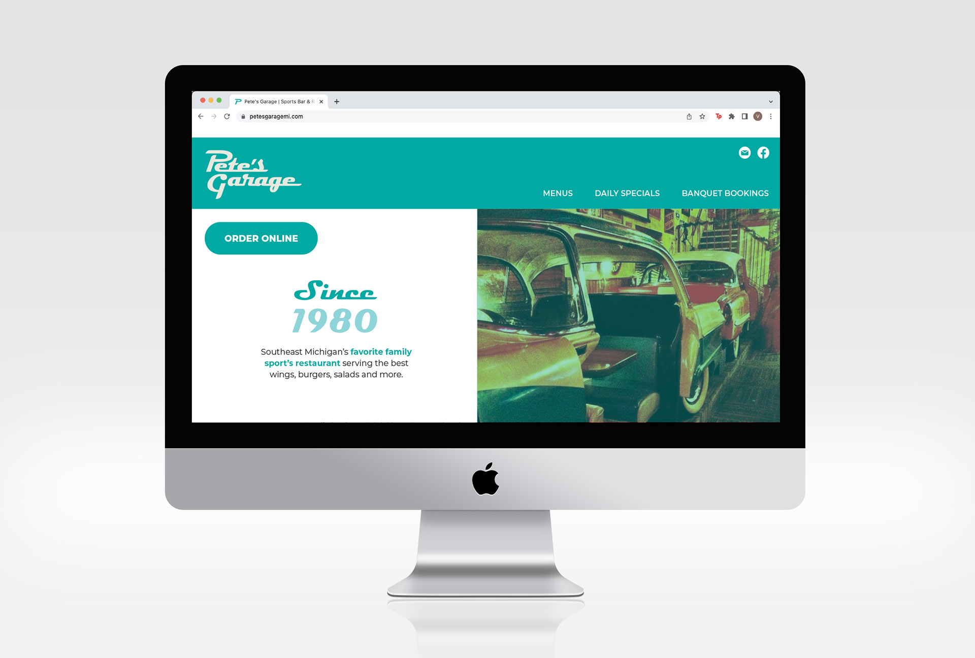
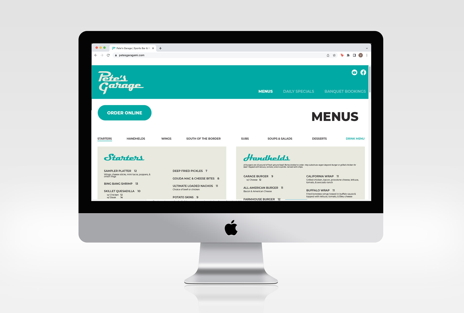
I also chose to update the website for patrons that choose to view Pete's Garage before attending. Many younger generations choose to look up the menu of restaurants they are thinking on visiting, making the website their first impression. Each page on the website is easy to navigate, accessible for all, and now includes a large "Order Online" button to encourage additional revenue through Pete's Garage delivery.
