
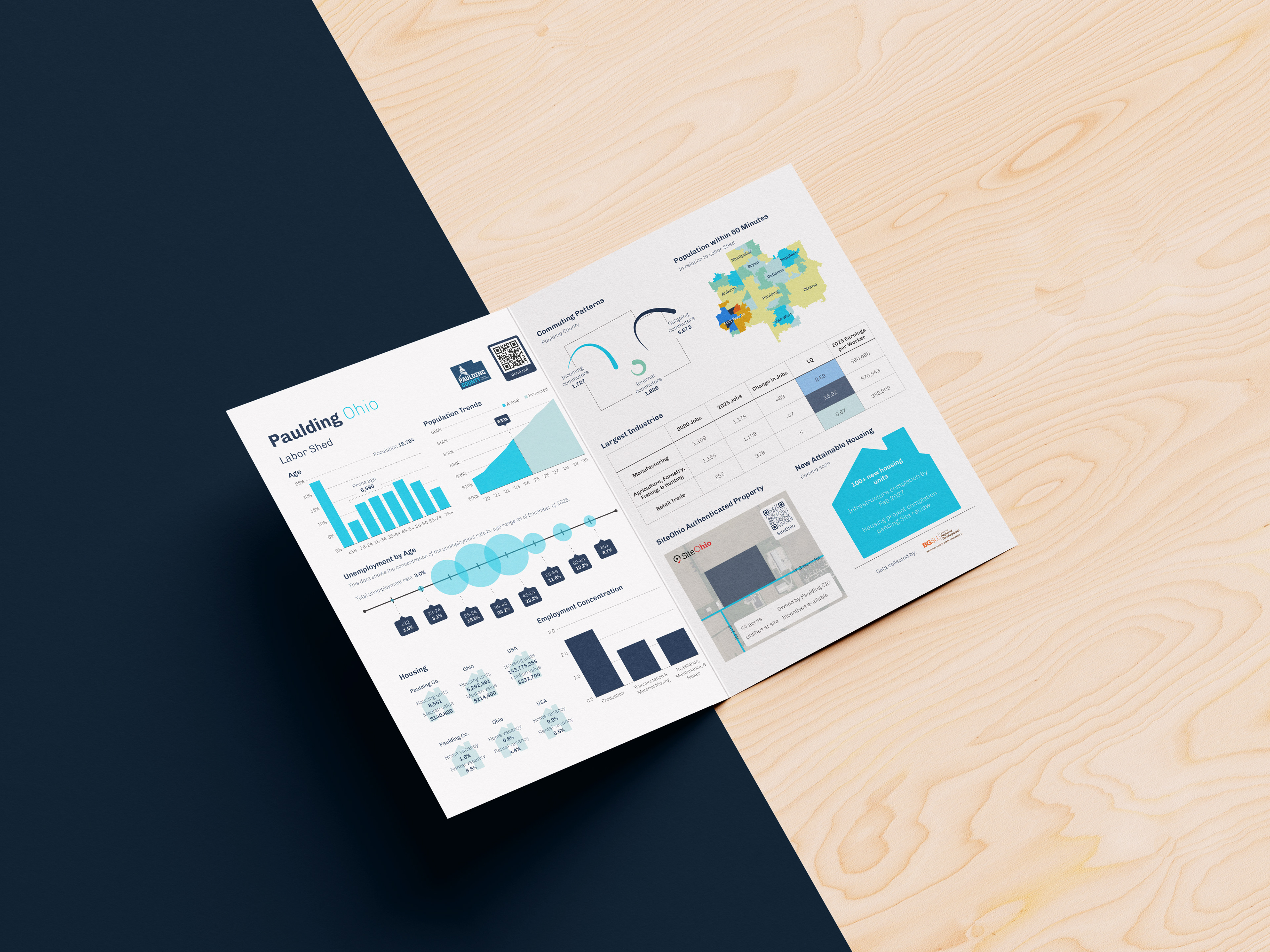
Creating this one-pager, while concise, requires great attention to detail and thought. Twelve different points of information had to be boiled down into one page, front and back, with little to no narrative to accompany. This leaves the weight of communication all on the visualizations.
With a large quantity of data visualizations, the key is to creatively come up with ways to communicate the data besides bar graphs and line charts. It is important to be up to date on the newest and best practices in the field while also adhering to brand guidelines.
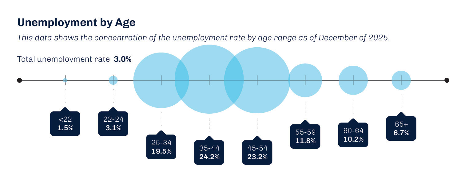
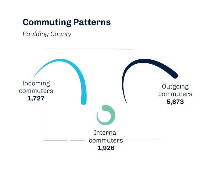
An example of this is the bubble timeline and the commuting patterns, shown above. Showing large concentrations of data does not have to be simplified into a square format. It can be fun, playful, and interesting to look at from the perspective of the audience.
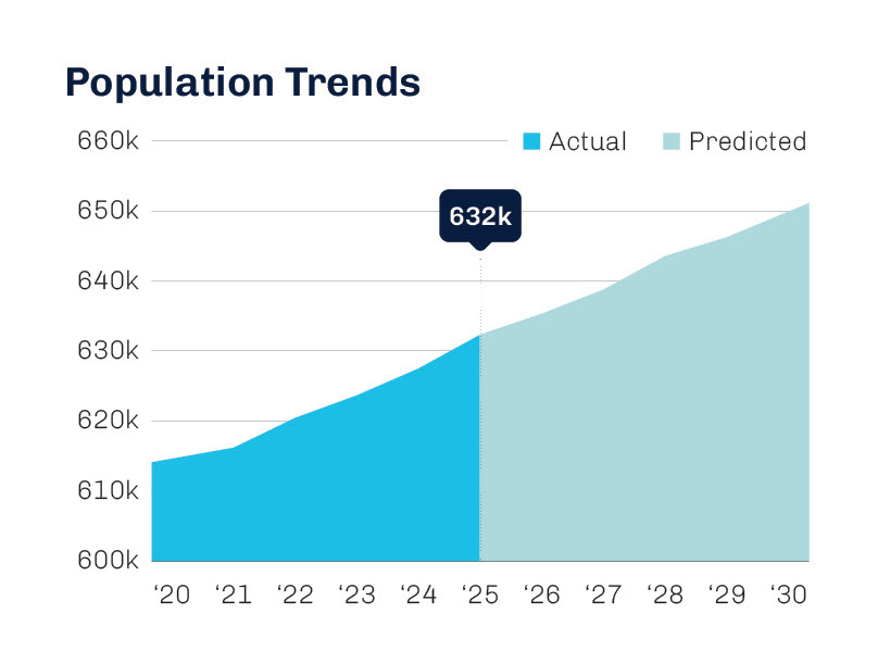
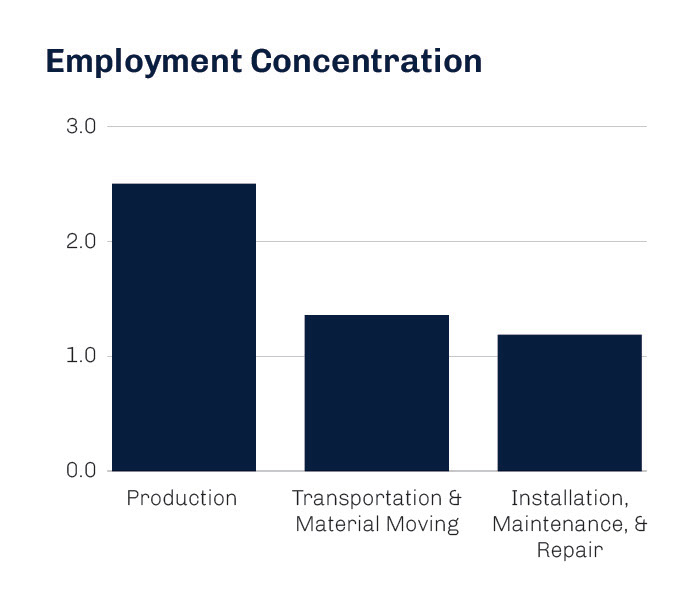
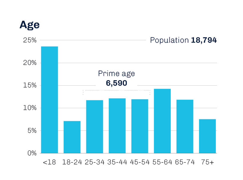
One of my strengths in this area of design is knowing when the simplest visualization is the best one. In cases where such large quantities of data are meant to be displayed in a small space, fatigue is common. Making the information simple and easy to comprehend important.