This impact analysis final report was novel for my team and I to create. It consisted of a large quantity of text and data. Such a composition requires a delicate hand, making sure the information is easily readable and minimizes audience burn-out.
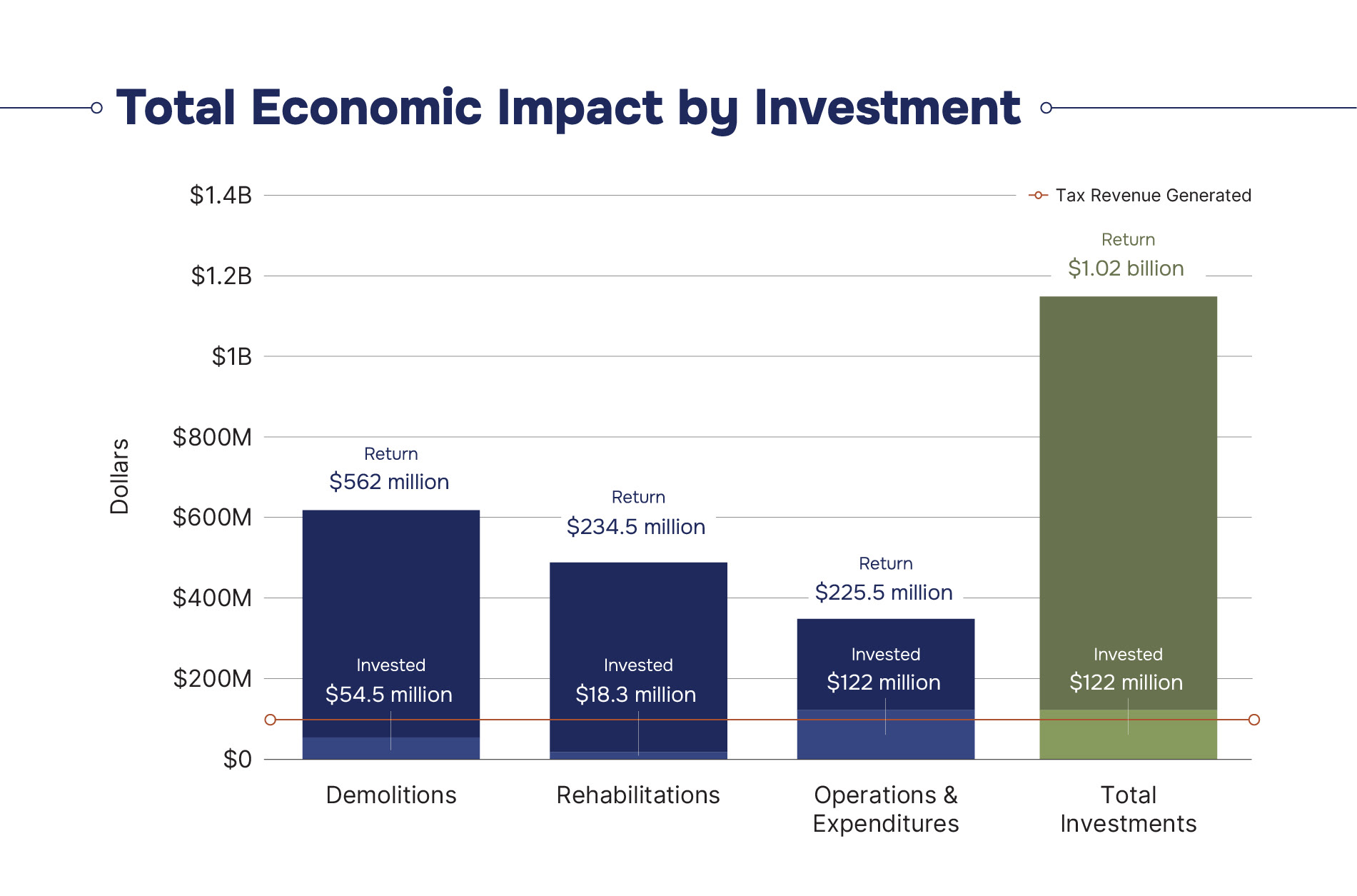
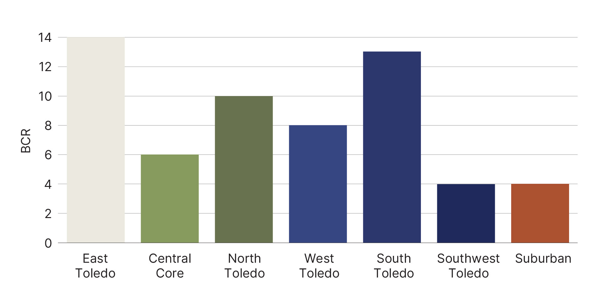
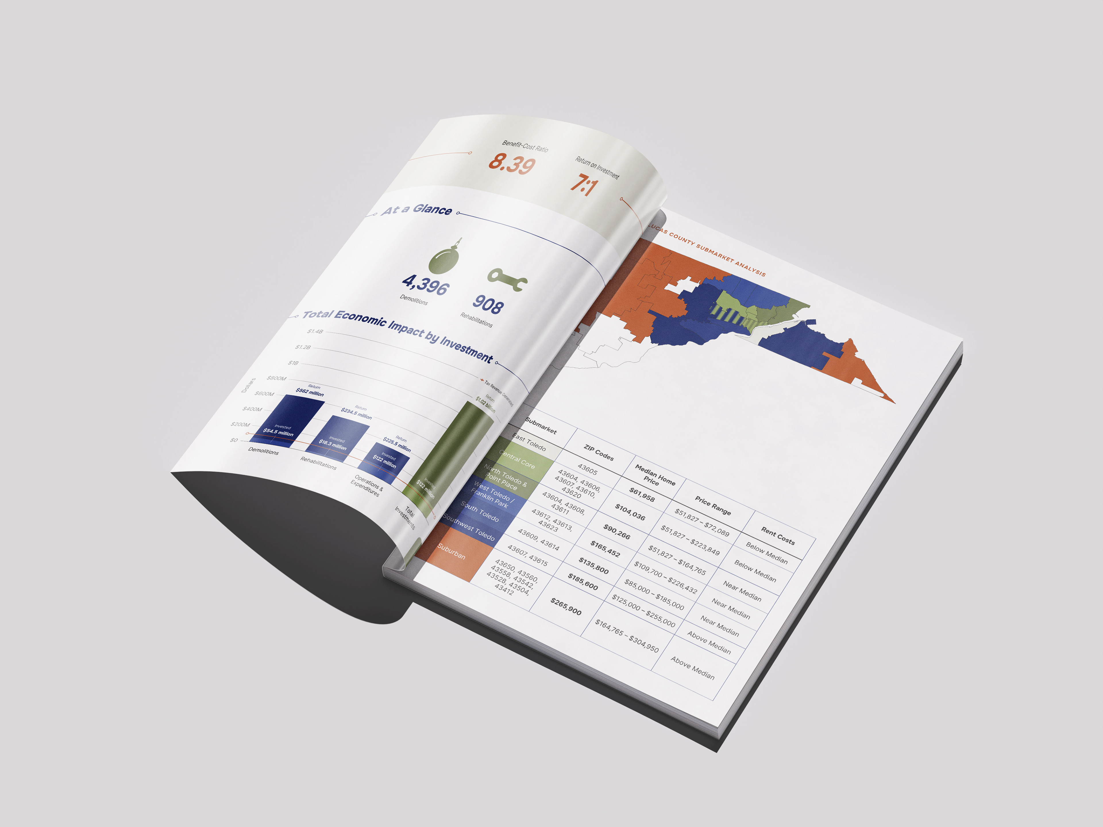
Since there weren't many visualizations that could be made with this information, I wanted to make sure the one that I could make had a high impact. For example, the first iteration of the map below was just supposed to be a table with colors. Instead, I went the extra mile to create a heat map showing all zip codes in the county and where they land in terms of housing availability.
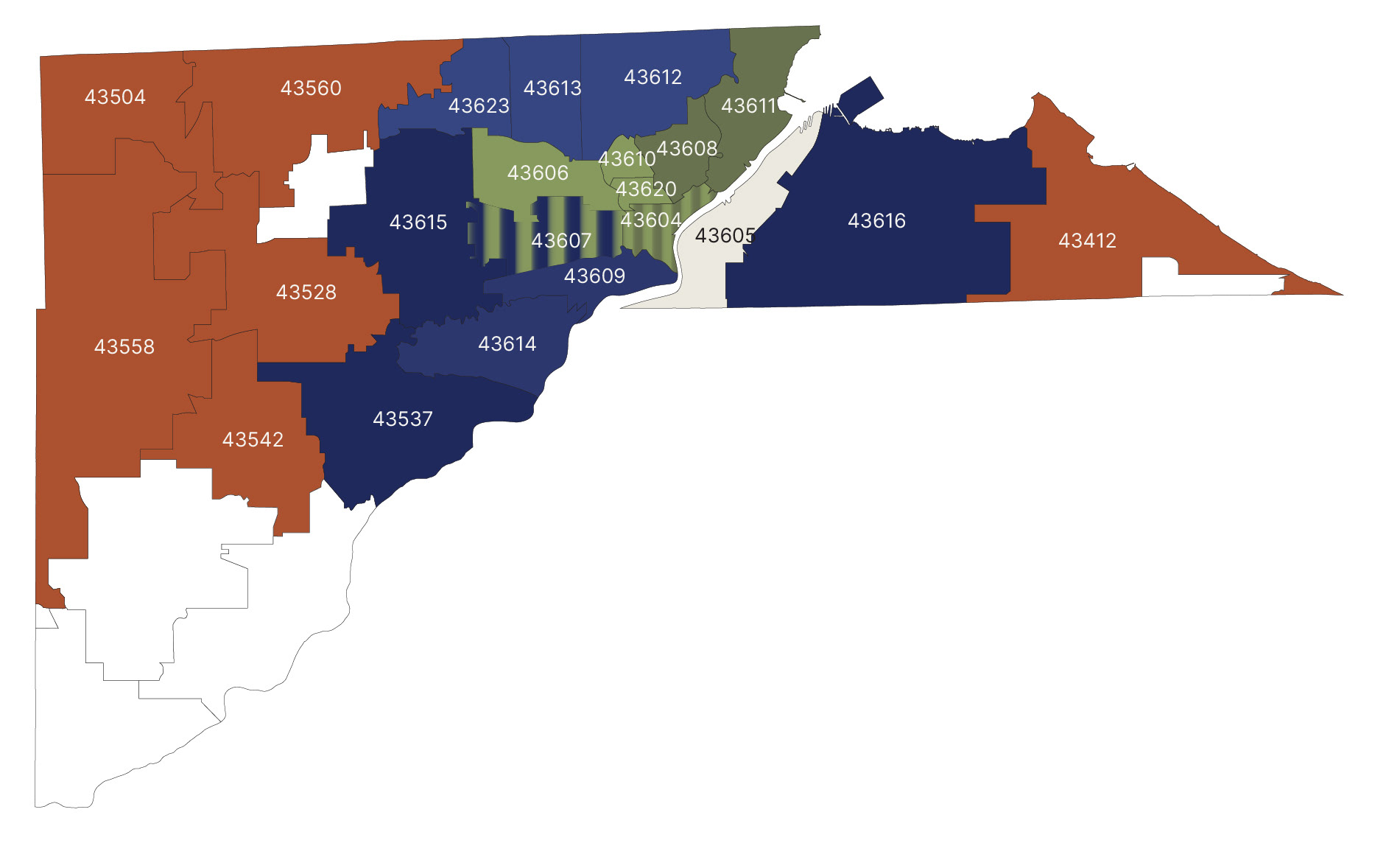
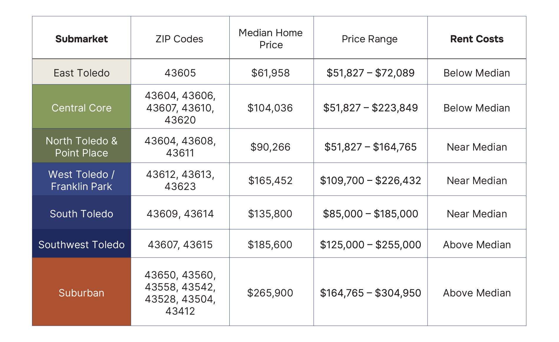
It is important, especially in this case, to visualize data and information in ways other than tables. For one, it is easier to understand and faster to decipher. It also creates visual interest and breaks up the monotony of the text.