
The City of Fremont, Ohio contracted with the Center for Regional Development to create a series of data visualizations on basic data points surrounding the city. I was tasked with creating these designs from scratch and within the same branding system that the City has already established.
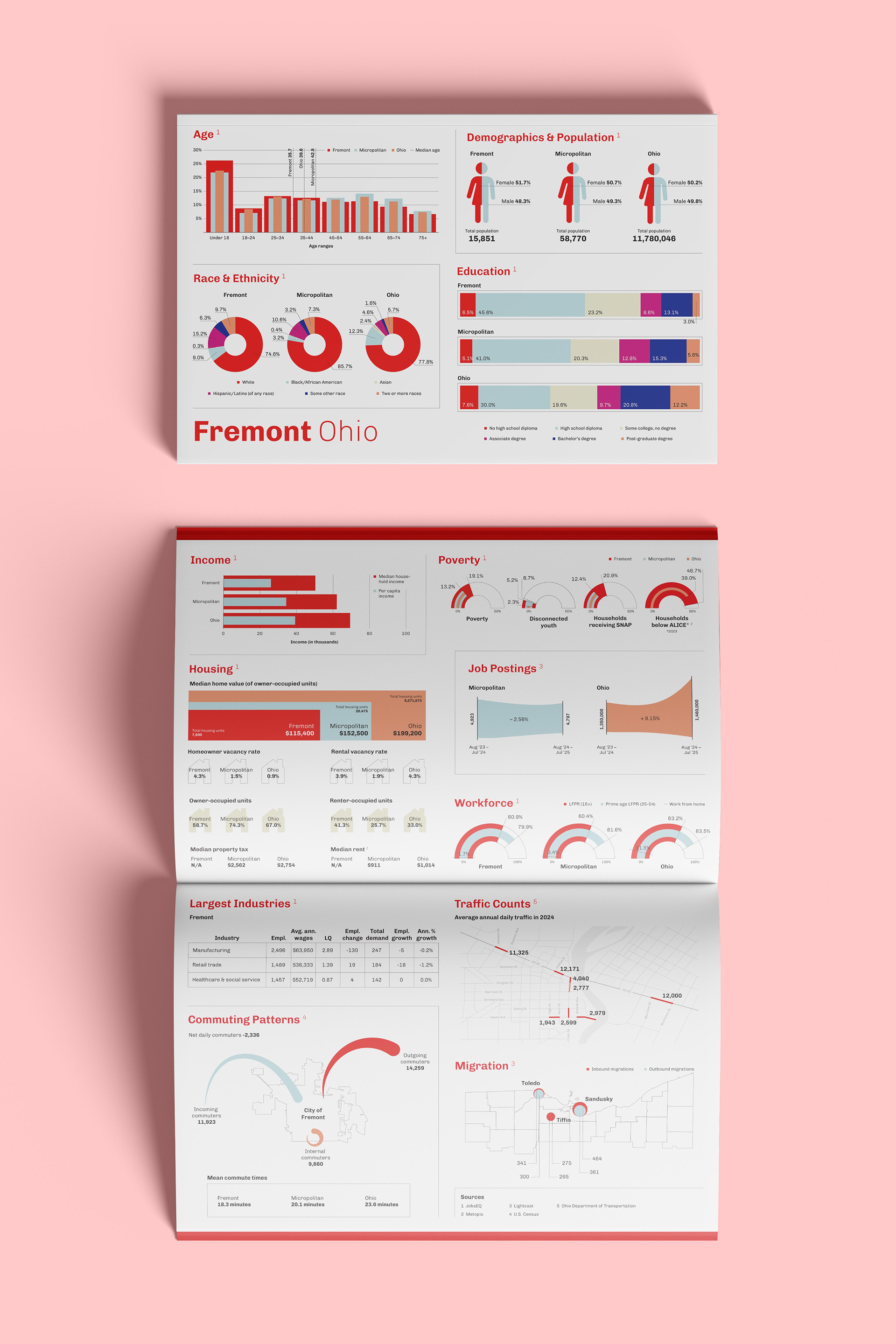
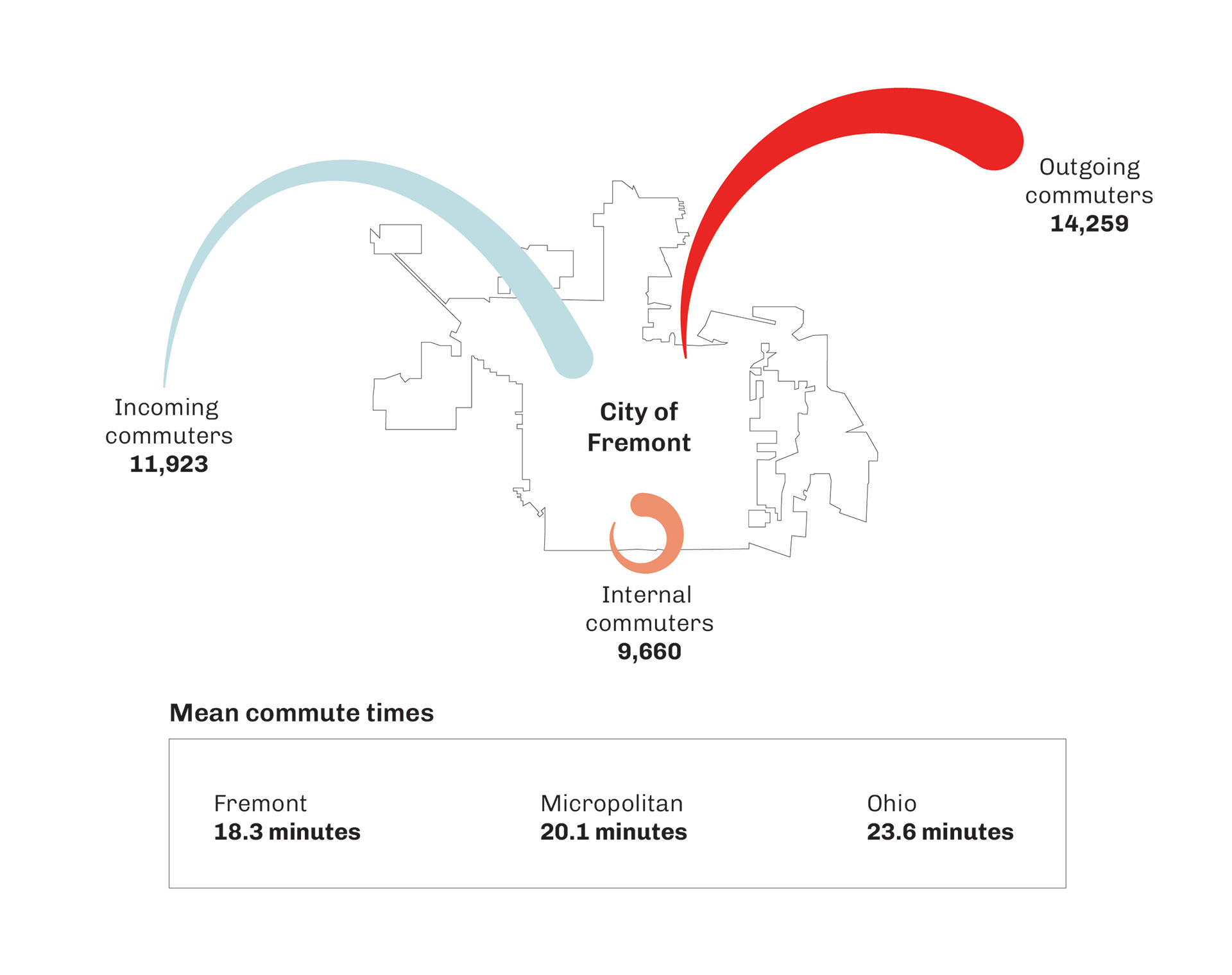
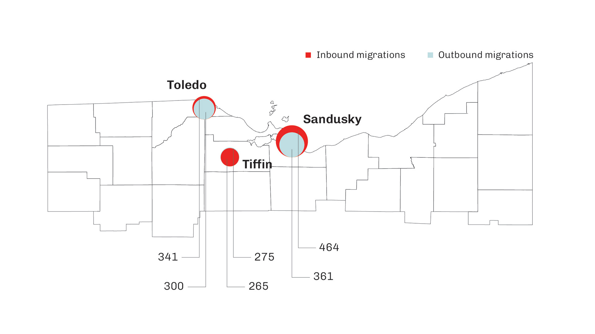
Many of these data points given do not have conventional ways of visualizing the data. In these cases, simple bar graphs do not communicate as well as more illustrated stories do. Since this project was very localized, bringing in points of recognition–such as maps and city borders–allows the general public familiar with the area to digest the information in an easier way.
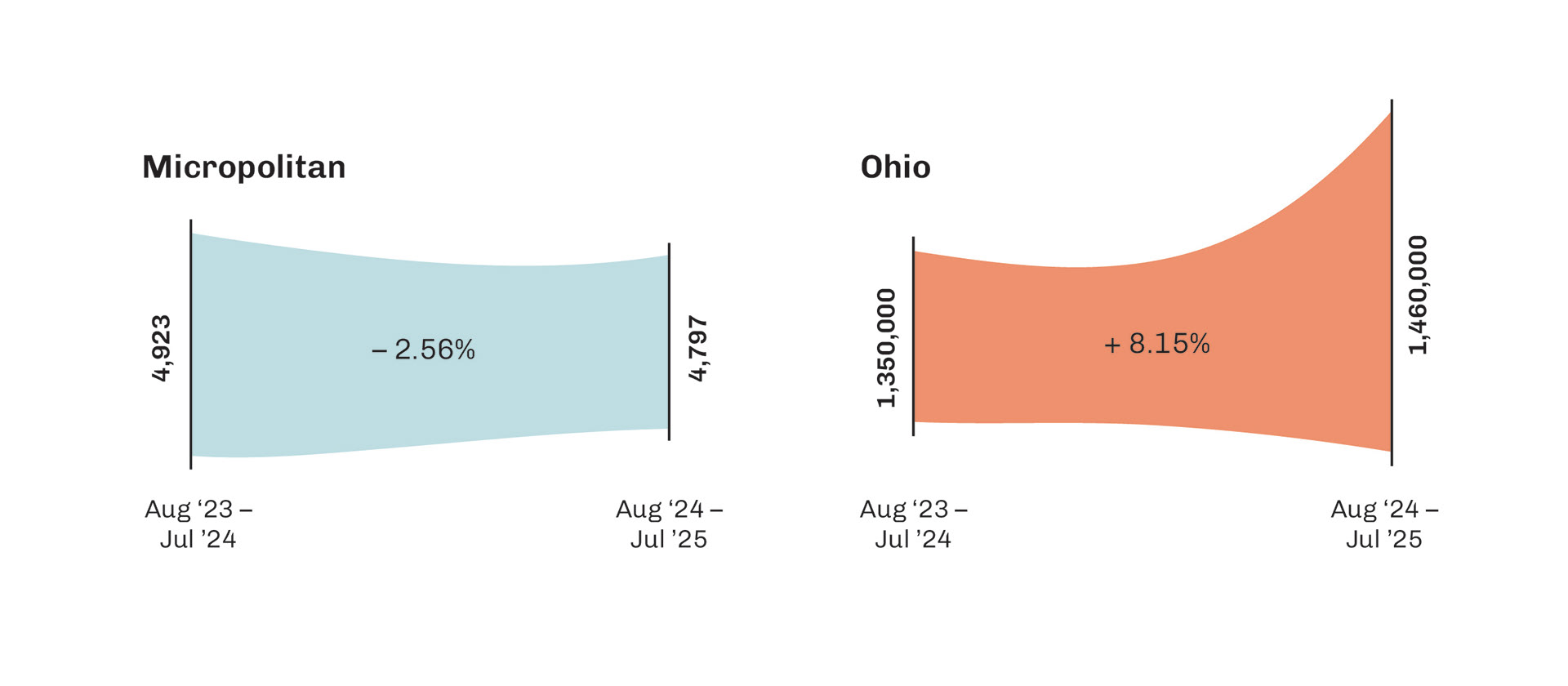
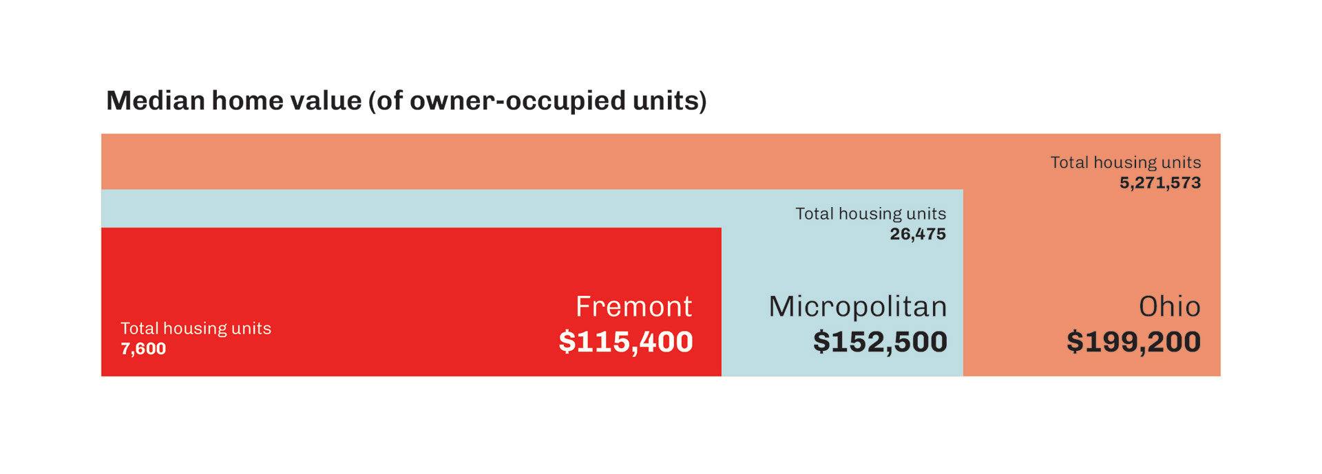
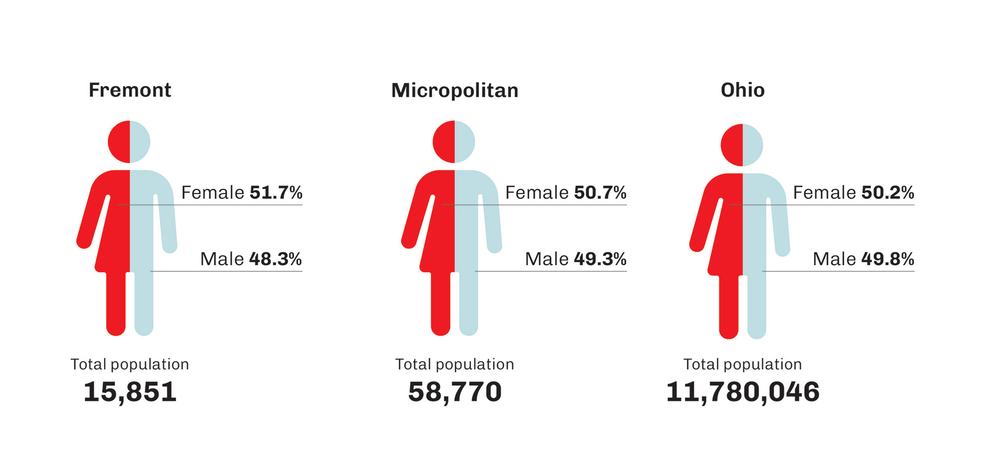
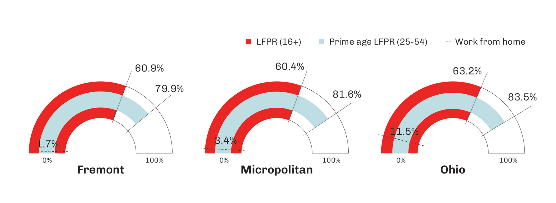
Some data points require an innovative visualization to better understand the difference between 2 or more categories or time periods. Above, you can see an example of such. Some cases, as below, simple bar graphs or ratios do the job just fine.
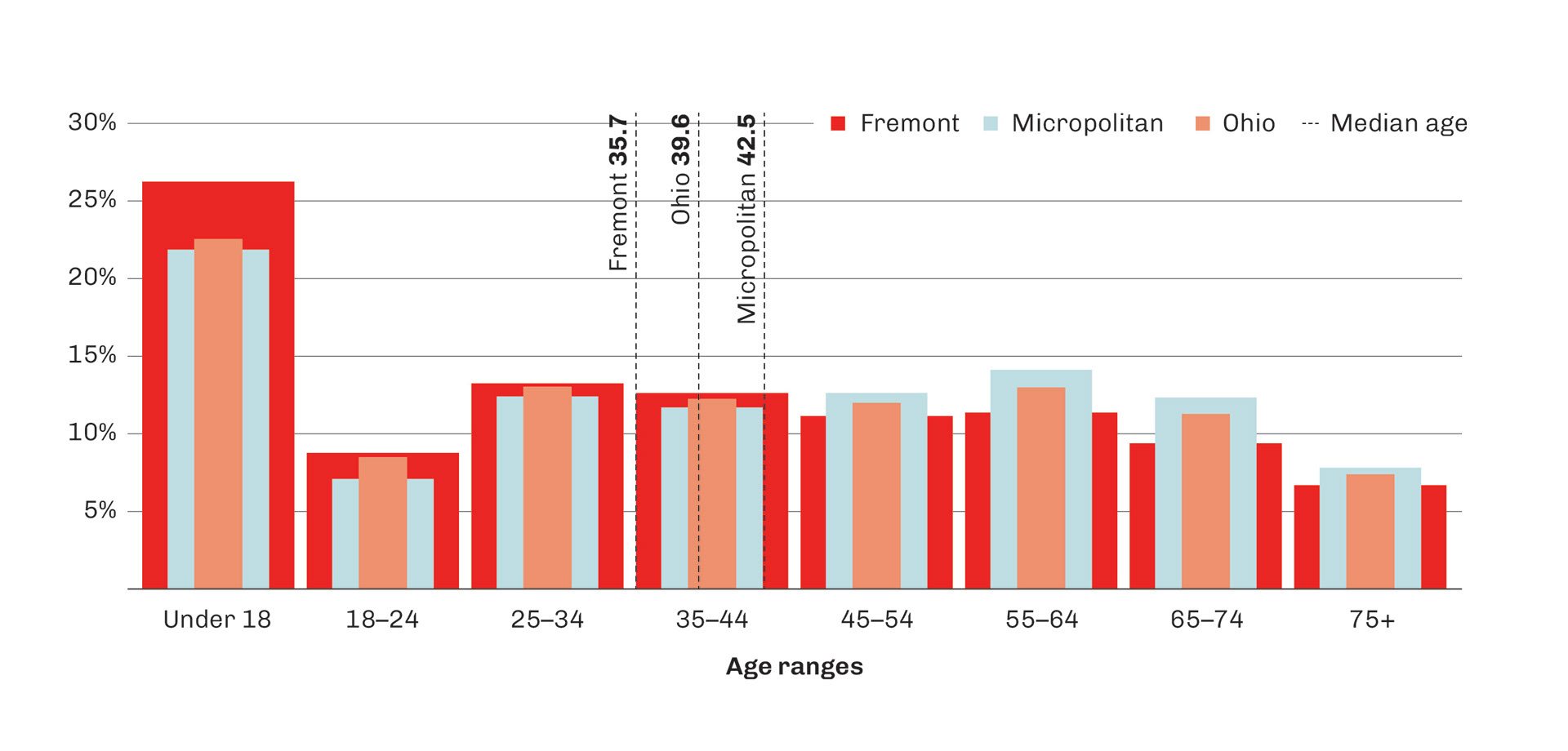
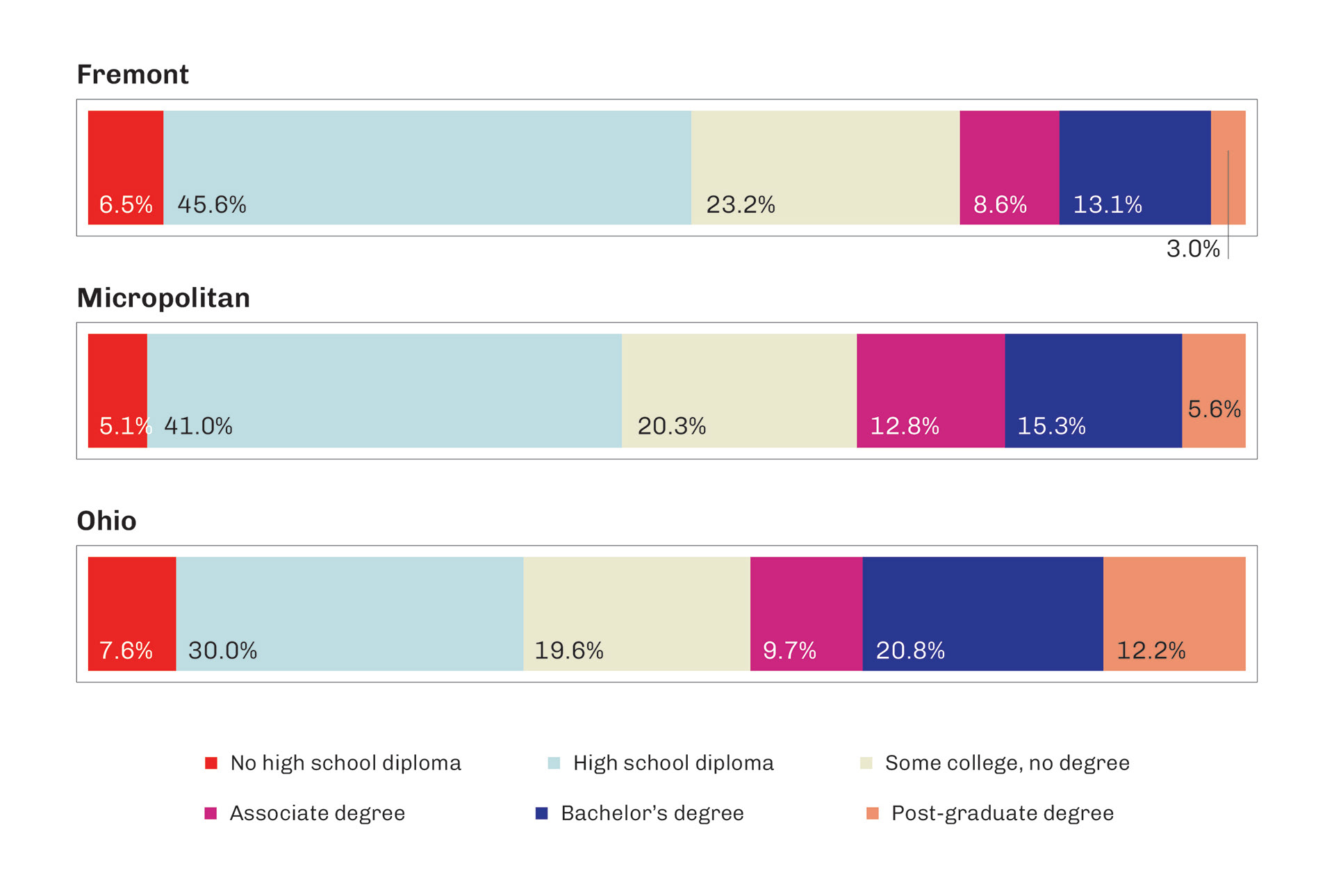
Even so, there are opportunities to change the game in bar graphs. The same principle applies, but visually breaks up the monotony of the bar graph.